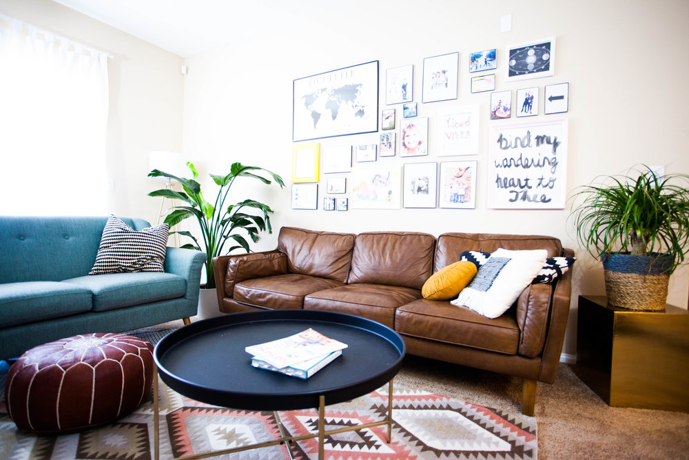

Leather flower pouf: Etsy
Leather sofa: Overstock
Teal love seat: World Market
Coffee table: Threshold for Target
Gold side table: Target
Rug: Target
I don’t know much about interior design, but I do love to decorate. My goal is always to have my home feel very me. I want to spend my time in a space that I love, that inspires my writing, that makes me happy to take photos of my family inside. I need to feel really good about how my home looks, even if it’s not perfect.
I can’t stand having plain walls or temporary furniture that I don’t love. My home is very important to me, and I want my family to feel safe and cozy here. I also want to make sure that I like what I see and that I spend my days in a place that shows my personality and style.
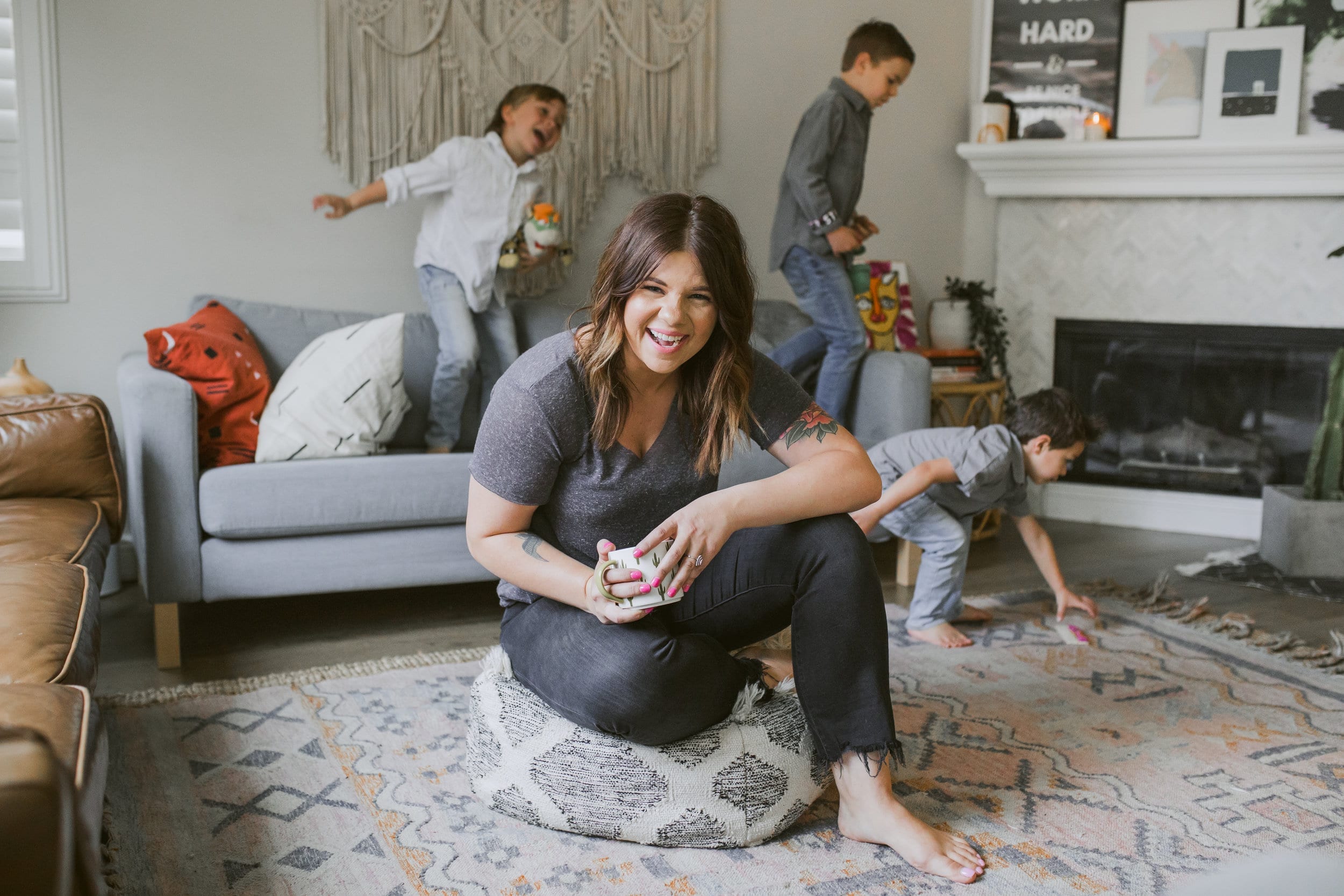
I don’t know how one would officially describe my decorating, but I like to think of it as cozy and modern. I appreciate white, straight lines, and trend. I also appreciate cozy throw pillows, a shelf full of books, and a couch you can curl up in. I never want my family or my guests to feel like they can’t come in and relax.
Since I’ve been getting asked a lot about my decor as we’ve been transitioning out of full-time travel and into our little apartment (a temporary home while we figure out what we want in terms of buying or renting), I thought I’d show it off a little and share where I bought things and how I decided how to style the main areas.
Since this is a very temporary home (and an apartment), we couldn’t change much about it. Instead of finding creative ways to cover the things we don’t like, which is what we usually do when we know we’re staying longer-term, I found ways to distract from the not-my-favorite features.
I’m sharing my tips and tricks with you today!
1. Distract from the features you don’t like.
Our apartment has dark beige carpet. I despise carpet for many reasons, but in this house I’m glad we have it since another family lives below us (bless their hearts. And ears…). However, that doesn’t mean I have to just deal with it. My goal was to use decor placement and color to draw the eye to other parts of the house in each room. My gallery wall, plants placed up high, colorful loveseat, and rugs all help accomplish this.
2. Oversized rugs and rug layering.
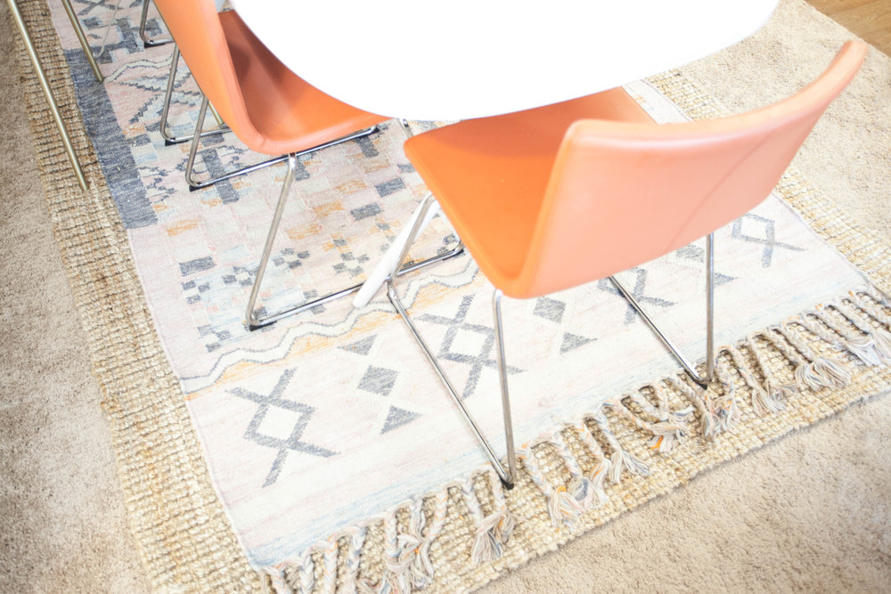

Rug: World Market
Jute rug: RugsUSA
Table & chairs: IKEA
Rug layering is a newer trend I started seeing a lot on Pinterest last year. I love the look and decided to be brave and give it a try as part of Mission: Distract From the Carpet. The trick is to use two totally different patterns that compliment each other, and let me tell you… it is terrifying to do this at the store or online when you’re a visual learner. I really wished I could’ve seen it in my living room first, but everything I risked ended being exactly what I was going for!
I bought oversized rugs to fill two of my rooms almost wall-to-wall (because again, the carpet). In my office, I put an IKEA rug and in the kids’ room, I used a Rugs USA rug with lots of color.
3. Put a gallery wall in your living room.
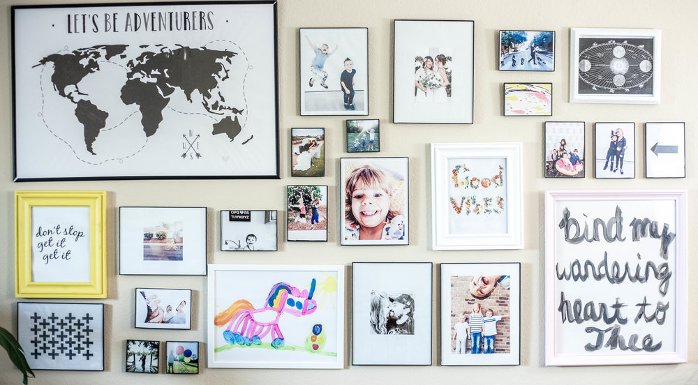

Thin black frames: Target
Colored frames: thrifted and painted by me
Gallery walls are a great way to showcase your style. I did this by choosing mostly thin, black, modern frames and drawing most of the attention to my photos. They’re also great for bringing a little personality to a room.
If your landlord doesn’t want you to use nails in the wall, use Command Strips. There’s an entire aisle at Target dedicated to those things- they’re amazing and you can now decorate however you like, even in a rental because of them.
When it comes to the living room, I like mine to feel personal and cozy, so I wasn’t going for clean, perfect lines and matching frames in a neat row with this wall. I chose some of my favorite photos of our family, some printables with words I like, and I stuck family artwork in there to really relax the look of this wall.
For a subtle pop of color amongst the thin black frames, I included a really happy yellow and a pretty, soft pink frame as well. I also intentionally placed the colorful pieces toward the center of the collage to compliment the bright frames on the outer edges. There’s nothing to a gallery wall except eyeing it.
I laid all my frames out on the floor in front of this wall and placed each frame where I wanted it to go before hanging them, and it still somehow came out different than it had looked, but I ran with it and fit things in as needed until it looked right.
I also did a huge InstaStory as I decorated this wall and people found it really helpful. If you want to see things like that and my daily cup of coffee (I mean, who doesn’t want to miss THAT?!), click here to follow me on Instagram.
Is clutter your real problem? Been there!
Check out Your Uncluttered Home, my globally-praised online decluttering course for moms.
I’ll walk you through the A-Z of minimalism for every room in your home.
Let’s get you simplified so you can walk into a home you love and stop spending your weekends catching up on cleaning!


4. Fill space with oversized art.
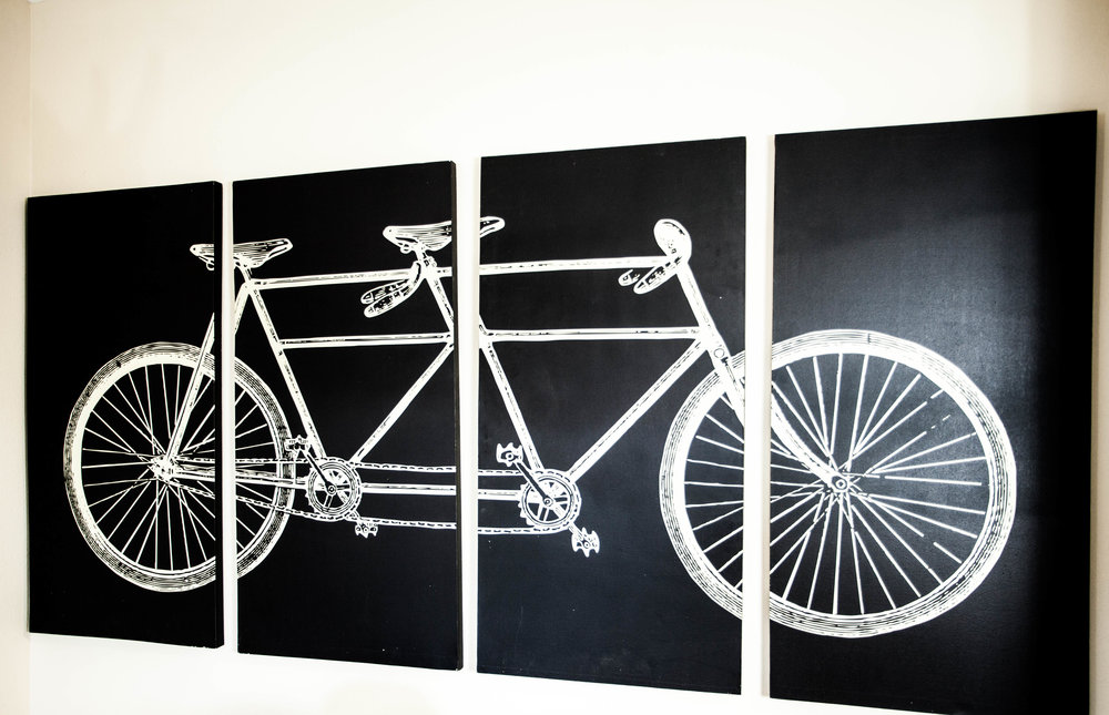

We scored this Pottery Barn bicycle art from Brian’s dad when he was moving a few years ago. My old timer Instagram followers know it’s my staple piece. It’s so big that it instantly fills an entire wall in an empty space when we move and makes the room come together and feel “lived in”. You can score oversized art at estate sales, online, thrift stores, garage sales, really anywhere that fits your budget. Just keep your eye out for the perfect piece.
You can also make your own oversized art (maybe not as big as the bike canvases….) for super cheap! I talked all about how I did that for the main wall in our bedroom, and you can even view my tutorial by reading this post.


Chandelier: World Market
5. Swap the statement rental pieces that aren’t a big deal to put back when you leave.
When will landlords and rental companies start decorating in ways that fit most styles?? It’s always either outdated or severely contemporary- so not my style. When I come into a new rental, Two things I almost always do is swap the blinds for curtains (or put curtains over the blinds to hide them), and store whatever hideous pendant light they have hanging in the dining area and replace it with a statement piece that fits my style.
6. Base your decor on how the room will be used.


Hanging plants (fake): IKEA
Sofa: IKEA
Rug: IKEA
Fur blanket: IKEA
Throw pillows: Target
Basket: Target
White bookshelf: handmade by my hubby
My style tends to shift slightly depending on what the room I’m decorating will be used for. For example, my living room is much cozier than my office. In my office, I need to be inspired and feel productive, so I opt for lots more white, lots of clean lines, less color, and less coziness.
7. If the kids share a room, keep everything neutral, but sneak in personal touches.
In our last house, my kids all shared one huge room even though they had the option of splitting up a little. In this rental, we decided they’d keep sharing one room so that we could make an apartment work for a few months while still having a workspace to run the business. We ordered double bunk beds, and to keep things from looking chaotic in a tiny space, I got them all matching white quilts.
To bring each of my kids’ personalities into the room, I let them pick out their bed sheets while we were at Target. The Pillowfort Kids line is to die for! Each child has their own set of sheets, so when they pull back the covers to crawl in for the night, it feels a little more them and not just a neutral white zone without personality.


Throw pillows: Target
Floral sheets: Urban Outfitters
Side table: Target
Macrame wall hanging: Target
Curtains: IKEA
Reading light: Target
Planter: Target
Headboard: IKEA
Printables: made by me
Note: I get asked a lot if having white is a pain to keep clean with four kids in the house. My answer is always that it’s actually easier. Kids spill no matter what, and knowing that I can throw some bleach in the wash and easily get every stain out is much more comforting than a patterned or colored piece that I’d have to be careful stain-treating.
8. Use temporary tricks.
There are so many more options for making a rental look more like you nowadays. If your rental isn’t as temporary as ours, you can really go crazy! Use these anti-mold subway tile stickers to cover an ugly backsplash in your kitchen or bathroom (we used these in our camper and they’re great!), put this peel and stick wallpaper to give a room more personality. These items won’t damage your place when you remove it and it makes it feel SO much better!
A temporary home with details you don’t exactly like (like brown carpet) doesn’t mean you have to just grin and bear it until you move. You can make any rental look beautiful and put your personal touch on it without causing damage you’ll pay for later.
Is clutter your real problem? Been there!
Check out Your Uncluttered Home, my globally-praised online decluttering course for moms.
I’ll walk you through the A-Z of minimalism for every room in your home.
Let’s get you simplified so you can walk into a home you love and stop spending your weekends catching up on cleaning!








+ show Comments
- Hide Comments
add a comment